August 2009 Archives
Because to many people, Google Earth is not suitable for all 95% of the computer population out there, Google Maps (and other competing dynamic map platform) is still the way to go to display geographical data.
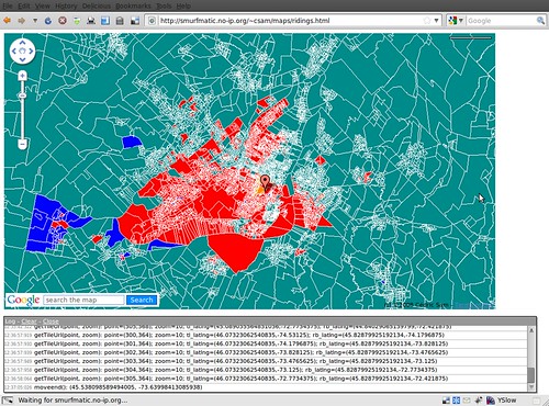
However, what if the data that you want to display is simply too heavy for the client side to display? For instance, you want to overlay polygons representing electoral districts (each 308 of them in Canada). But loading all of these in Google Maps is not practical for the average computer in 2009.
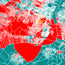
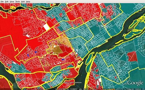
You might want to explore a server-side method to serving the data. This could be with MapServer, which in a nutshell serves image "tiles" (we make them to be 256x256 PNGs for Google Maps) to the client. For instance, the following image may be such a tile:
Behind the scenes, MapServer goes to the data source and outputs by CGI the right image. The data source can be a Shapefile or other, but can also be a database, namely a PostgreSQL DB with Postgis. Read the MapServer FAQ to see how awesome it can be.
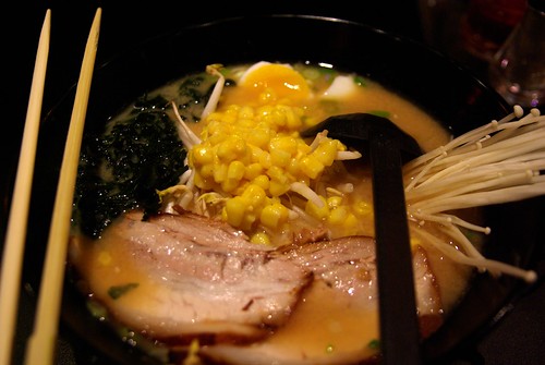
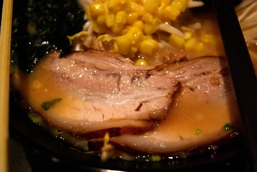
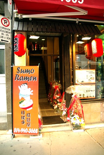
A new ramen restaurant opened in Chinatown last week, following in the footsteps of Ramen-Ya (also on St-Laurent, but just a couple of kms north). The name of the restaurant is Sumo Ramen and took place in what used to be a skate shop.
One of the owners is Anthony, a stylish Cantonese-speaking 30-something. He originally rented the space, and for siz months, did not know what to do with it. When his friend came back from living in Japan for several years, they decided together to start ther ramen business.
The friend who I went with said that the place reminded him of what restaurants in Asia look like, a far cry from stuck-in-60s Chinese restaurant of the old Chinatown.
2008-09 has seen the arrival of an impressive number of new restaurants in Chintown, one trendier than the other. It started with Little Sheep and things moved on with Hanashima (a Japanese-style fondue restaurant), and two new bakeries, Harmonie and Callia. I also saw a Sichuan-style restaurant and another "spicy" joint.
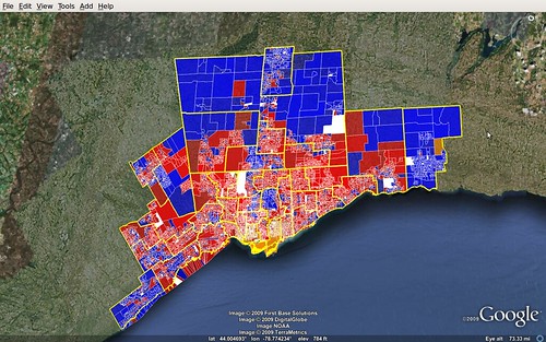
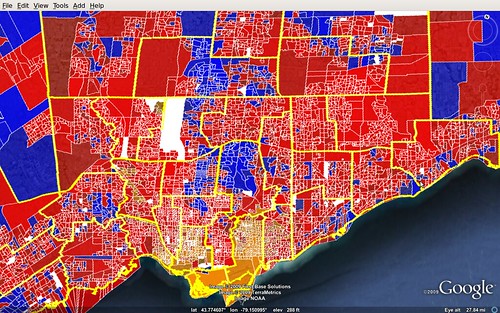
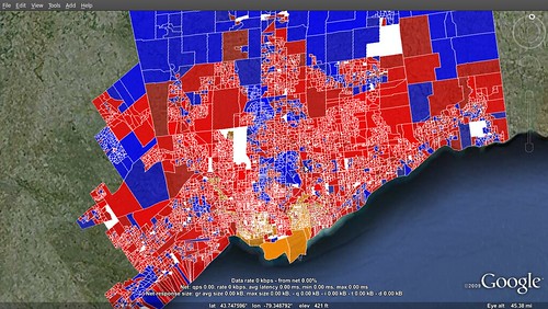
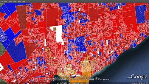
In these two shots of Greater Toronto, I coloured the polls per winner, with shades representing the margin of victory.
Not too surprisingly, the NDP dominate the most urban neighbourhoods, while the suburbs are shared between Conservatives and Liberals, with a greater dominance by Deep Blue in the outer rings, and that of Deep Red within the inner suburbs.
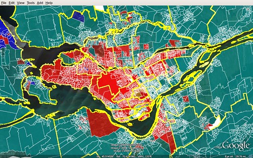
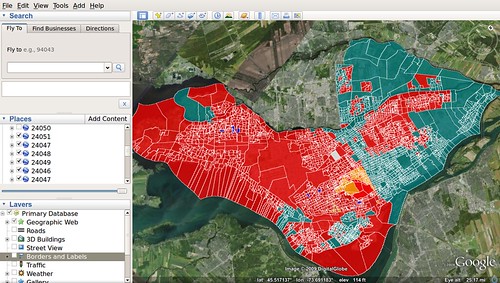
In Montreal, the portrait is a bit more interesting, with very deep divisions. Most of the area outside of the island of Montreal votes Bloc, so does the North-east part of Montreal, where a French-speaking majority resides.
The only places that're notably blue? Hudson, an old English-speaking town and NDP leader Jack Layton's hometown, too. And Saint-Lazare.
This is another follow-up for this project.
I've managed to now make results that are shaded by the margin of victory. The alpha, or transparency, is a value proportion between 0 and 1. Because the margin of victory rarely goes above, say, 0.4 (40%), then we have to transform that number so that the map doesn't look like a succession of transparent polygons. To each proportion value, I crossed it with a root 8 ("** 0.125" in python). So, a 0.1 margin of victory becomes around 0.75, and 0.2 is 0.8.
Here is a part of the code that I used to customize the poly style:
if totalVotes > 0:

    prop_votes = (maxVotes - secondVotes) * 1.0 / totalVotes

    alpha = int(round(prop_votes ** 0.125 * 256)) * 0x1000000

    color += alpha

if maxVotes == secondVotes or totalVotes == 0: # votes of top two are equal

    color = 0xffffffff

polyStyle.set_color(kmlbase.Color32(color))
Here is the result for Greater Toronto:
Next step, balloons...
This is a follow-up to the project discussed here.
I have now advanced my code (about 120 lines in Python) to generate the maps color-coded with the poll's winner in the 2008 federal general election. With an example such as the island of Montreal, it would probably be even more interesting to merge it with census data, for instance the % of francophones or % of people born outside of Canada. From one's informal appreciation of Montreal's linguistic diversity, one can definetely see where the Bloc votes mainly come from. As well, we can't really see polls voting massively for the Conservatives, besides a few in the West Island.
Like we say, the future is now, and it's way simpler than we think.
The KML file for each riding is at this point around 200-300Kb, which becomes almost nothing once compressed to KMZ (expect a 1/10 size reduction). This becomes a very "portable" product, as the KMLs could be pre-generated, editorialized and served to the general public without any need to "carry around" the back-end. A more custom version of the script (coloured by proportional votes per party, say) could even be used by political parties to plan the next campaign, which could happen in Fall 2009.
Next steps: 1- transparency that will give an idea of how deep the margin of victory is in each riding and 2- clickable info windows. When I'll finish these, I'll have re-built my 2008 app from scratch, albeit with a much cleaner infrastructure (now with Python + libkml and PostgreSQL/Postgis, instead of a bunch of PHP scripts and non-spatial MySQL), which should allow me to speed up development time by a lot for customizations, etc.
For client-side performance issues, we can eventually use a combination of MapServer and TileCache, and then serve the data from a platform like Google Maps or any other competing one.
So right now I am working on an experimental project to produce a mashup with the electoral data down to the polling station level.
Right now, I imported the data from the Shapefile provided free of charge on Geogratis to a PostgreSQL w/ Postgis database.
I am then using the libkml library (with SWIG bindings) to merge the data from postgis. Postgis conveniently has a SQL function called "ST_AsKML()" that outputs the geometry as the corresponding KML code. Here is the code that I used:
#!/usr/bin/env python

import sys
import pg
import kmlbase
import kmldom
import kmlengine

def usage():
    return 'usage: riding.py [fed_num]'

def main():
    if len(sys.argv) > 1:
	if len(sys.argv[1]) != 5:
	   print usage()
	   return False
	factory = kmldom.KmlFactory_GetFactory()
	docu = factory.CreateDocument()
	docu.set_name(sys.argv[1])
	kml = factory.CreateKml()
	kml.set_feature(docu)
	conn = pg.connect('postgis', '127.0.0.1', 5432, None, None, 'DB_NAME', 'DB_PASS')
	rows = conn.query('SELECT pd_id, pd_num, pd_nbr_sfx, pd_type, adv_poll, ed_id, fed_num, ST_AsKML(the_geom) as boundary FROM pd308_a WHERE fed_num = %05d ORDER BY pd_num ' % int(sys.argv[1]))
	res = rows.dictresult()
	for poll in res:
	    pl = factory.CreatePlacemark()
	    pl.set_name(str(poll['pd_num']))
	    kmlfile,errors = kmlengine.KmlFile.CreateFromParse(poll['boundary'])
	    mg = kmldom.AsMultiGeometry(kmlfile.get_root())
	    pl.set_geometry(mg)
	    docu.add_feature(pl)
	print kmldom.SerializePretty(kml)
    else:
	print usage()

if __name__ == '__main__':
  main()
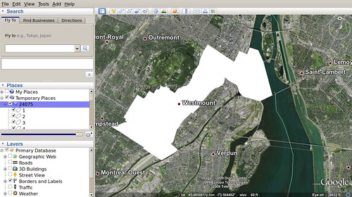
Run this on the command line with python (my version is 2.6). This code generates a KML file with all the different polls as separate placemarks for any given federal riding. For now, there is no styling or balloons.
Edit (2009-08-17): Here is the result if I randomize the polygon's colors.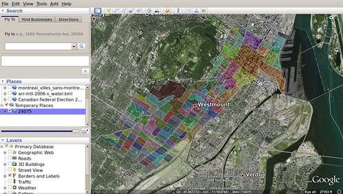
Download this generated KML (for Westmount--Ville-Marie - 24075)
Almost a year ago, I created a web app that would generate Google Earth maps with electoral districts and present/past results. This same app was adapted for use on national television (my employer until recently) and again adapted for the provincial election in Quebec, two months after the federal one.
Recently, a new app created by well-known (small c) conservative blogger Stephen Taylor (see video here below) was brought to my attention. What Mr. Taylor brings is in fact a very important and interesting level of granularity to the results. Elections Canada raw data for polling stations has for a long time been made available to everyone. What wasn't originally available last year was geographical boundary of the territory covered by each polling station comprised in an electoral riding.
This data is now available along the electoral district data that I originally found on GeoGratis (a Canada Natural Resources website).
The format provided is Shapefile. My original system relied on a MySQL database that kept plain decimal coordinates of electoral districts. Now, I've learned more about spatial geography tools such as PostGIS (a PostgreSQL extension, and the premier way of storing purely geographical features) and geo libraries like GDAL. Using shp2pgsql, I imported the data of this Shapefile to my database. This is currently where I am at.
I think that from there I will be looking at ways to import the results data to my PostgreSQL db. Then, I'll try to use Google's libkml library (code in Python) for managing and creating KML data (which is just XML really).
Because the ridings data is so heavy, perhaps it will be difficult to make a web-based app with every single one of the 308 ridings.
Maybe if this project takes off, I will try to start my contributions project again, which has taken a rest for lack of editorial need.