Google Earth : Carte élections fédérales Canada 2008 / Federal Election Map
Update (2011-10-11) - The 2011 edition of my electoral maps is out! I also open-sourced the scripts used to generate the KMLs (although not the same scripts used in 2008-09).
https://earth.smurfmatic.net/canada2011/
Update (2009-01-18) - Check out my newest project at https://earth.smurfmatic.net/canada2008/polls/. It lets you navigate between ridings, but most importantly gives you results at the poll division level, using new geographic data released earlier this year. (See this post for more details)
Interactive map here:
https://earth.smurfmatic.net/canada2008/
Une version de cette carte a été utilisée à Radio-Canada lors de la soirée électorale. / A version of this map was used on Radio-Canada Television during election night. (link)
(An English version of this entry follows below the pictures...)
Depuis quelques semaines, je m'affaire à monter une carte électorale du Canada. Je m'étais d'abord inspiré de ce que la ABC a fait pour les élections législatives en 2007 au pays des kangourous. En collaboration avec Google, la ABC avait alors publié une carte Flash utilisant l'API de Google Maps. Ils ont placé les positions pré-électorales, leurs prédictions, et le résultat, avec les couleurs représentant le parti détenant le district électoral, mais aussi la majorité prévue/obtenue.
Pour faire la version canadienne, je n'ai pas eu d'aide de Google, quoique le géant de la recherche possède une (vielle) version des circonscriptions (voir sous les frontières secondaires sous "Infos pratiques", dans la version desktop de Google Earth). J'ai pris des données géographiques gratuitement offertes par GéoGratis, un organisme du ministère canadien des ressources naturelles, et repositoire de cartes en tout genre. Elles étaient en format SHP (Shapefile), alors je les ai converties par un logiciel tiers vers un KML. J'aurais aussi pu ouvrir le SHP dans Google Earth Pro (le trial) et copier-coller les coordonnées.
J'ai parsé le tout pour une base de données des circonscriptions, partis politiques et de tous les candidats. Ces données sont disponibles sur le site d'Élections Canada en format texte CSV. Ç'en était pas moins un paquet de trouble royal à convertir et à valider (certaines bribes d'information n'étaient disponibles que sur le site du Parlement canadien).
L'un des features les plus intéressants de cette carte sont les network links. Ils permettent de mettre à jour les points, le contenu des info-bulles, etc à un intervalle de temps régulier ou selon la position du zoom sur des "régions" définies, de façon incrémentale selon le point de vue de l'usager. (Voir référence KML) Cette carte peut donc potentiellement servir à offrir des données live d'élections; ce que je ne ferai malheureusement pas.
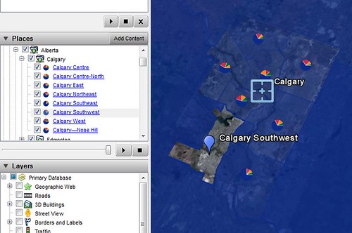
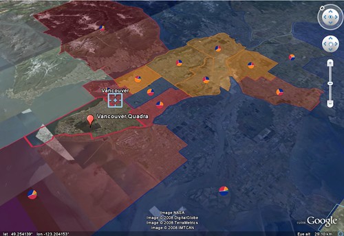
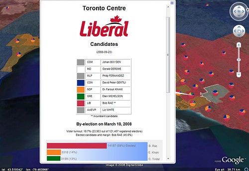
Finalement, le plus cool, c'est l'utilisation de Google Chart, une application qui génère des PNGs d'histogrammes et de diagrammes circulaires à partir d'une liste de labels, de données et méta-données. J'ai donc mappé les données des deux dernières élections.
Et voilà finalement quelques screenshots que j'ai prises de l'application...
Quelques features visuels de cette carte:
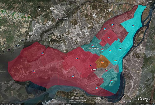
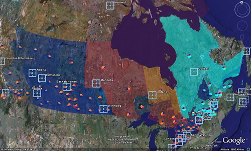
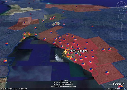
- La couleur du comté est celle du parti qui le détenait à la dissolution le 7 septembre. Donc je ne tiens pas compte du Vert à Vancouver, vu qu'il n'y pas encore eu de session parlementaire cet automne.
- Le niveau de transparence indique la marge de victoire du parti détenant le comté. Je ne fais cependant pas de correction dans le cas de transfuges politiques.
- Les pointes de tarte représentent la répartition des votes aux dernières élections (générale ou partielle selon les cas).
For the past few weeks, I've been working on a map of all Canadian ridings for the upcoming 40th general election. I was first inspired by a Google Maps + Flash application made by the ABC for the 2007 legislative election in Australia. It had the colors of the parties holding a seat, ABC's predictions, and the eventual outcome, along with different tones of color to indicate the margin of victory.
Google has secondary border data, but it isn't publicly available as far as I know. What I did to make a Canadian electoral map was to get the electoral district data from GeoGratis, a service of the Natural Resources Ministry that provides maps of all kinds free of charge. The data is in SHP (Shapefile) and was converted to the Google Earth KML format with a third-party program. I could've get the coordinates data (which is really what I need from GeoGratis' maps) with a copy-paste by opening the SHP file in the Google Earth Pro edition.
I then parsed everything to a database for ridings, political parties and candidates information. All the data is already available on the Elections Canada website in CSV text format. It was still a bit of a hassle to convert and normalize everything (I also had to import complementary data only available on the Canadian Parliament website).
One of the most interesting features of this map are the network links. They allow for incremental update of the map's points, polygons, info balloons based on the user's point of view, whether your above some pre-defined region, or at regular intervals of time (see KML reference). This map is able to show regularly updated data, which I won't be able because of time constraint.
Finally, the coolest feature (and most useful) is probably the inclusion of Google Chart, which can generate custom charts (bar, pie, etc) as PNG images from data sets and labels that you send to the script. So, with the data that I had, I could generate charts for the two previous elections for all ridings along with the icons representing the voting proportions at the last election this riding saw.
A couple of visual features:
- Riding color represents the party owning it at dissolution. That is, before Parliament starts sitting again, such that Blair Wilson is counted as an independent, not a Green.
- Transparency level represents the margin of victory. Does not work for floor-crossers.
- Pie charts represent vote shares at the last general election, or by-election if applicable.
Update (2008-10-15): The following is the use of my map by Canada's state television in French:
Link: https://www.youtube.com/watch?v=EqsYZQFSwiU
Also, the results are in!
Great application! Thanks.