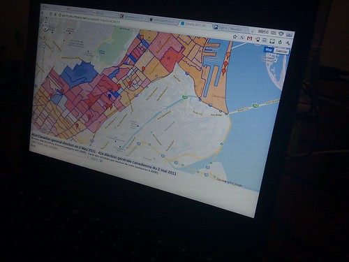
Canadian elections by polling division: now the 2011 maps
https://earth.smurfmatic.net/canada2011/polls/
Update (2011-10-16): Indeed, I've now added the political parties layers (the colors represent the proportion of votes by a party over the total number of votes) and a voters' turnout layer (nb of votes compiled over the nb of registered voters). If there are problems in interaction or information layout, please tell the interaction designer (me).
I finally got around last week to update my election maps to 2011. The new interface now lets you get the maps in good old 2-D Google Maps if your system doesn't support the Google Earth plugin.
The new version also lets you compare layers between each other. For now, I'm only offering the default "margin of victory" map for 2008 and 2011. Pretty soon, I will post maps specific to parties and the turnout rate. You are welcome to submit ideas of other geographic analyses.
Also, I've decided to release the code for this project to the open on GitHub.
Leave a comment